Ever wonder why some brands just feel right? It’s often not just what they say, but the colors they use to say it. Color psychology in branding is the art and science of using color to shape how people perceive your brand, guiding their decisions from the very first glance. It’s about choosing hues that don’t just look good, but that echo your core message, whether you want to inspire trust, create excitement, or signal cutting-edge innovation.
Your Brand's First Impression Is Decided by Color
Imagine your brand’s color palette as its outfit for a high-stakes meeting. Before you’ve said a word or demoed a single feature of your SaaS platform, your colors have already made an introduction. The right combination can instantly signal competence and build rapport; the wrong one can create a sense of unease or, worse, make you forgettable.
This isn't just a gut feeling—it's backed by some fascinating research. When someone first encounters your brand, they form a critical judgment in less than 90 seconds. And a huge 62-90% of that initial assessment is based on color alone. For B2B companies trying to capture the attention of busy decision-makers, that first impression is everything. You can dig deeper into these color psychology facts to see just how powerful this effect is.

Why Color Is a Core Business Strategy
When you understand color psychology in branding, you elevate your design choices from a subjective guessing game to a strategic business decision. It’s about being deliberate in how your audience perceives you. A thoughtfully chosen color palette isn't just decoration; it’s a silent workhorse that communicates your personality, values, and what you stand for.
This guide is a practical playbook for B2B and SaaS leaders. We’re going to break down how to use color to build a brand that truly connects with the people you want to reach.
Color is a silent ambassador for your brand. It works around the clock to convey your message, build recognition, and establish an emotional connection long before a customer ever interacts with your product.
For a quick reference, here’s a look at how common colors are often perceived in the B2B and SaaS world.
Quick Guide to Common Color Meanings in B2B Branding
| Color | Primary Association | Ideal For (SaaS/B2B Use Case) |
|---|---|---|
| Blue | Trust, Security, Stability | Fintech, Healthcare Tech, Enterprise Software, Cloud Services |
| Green | Growth, Success, ESG | Financial Services, CRM Platforms, Sustainability Tech, HR Software |
| Red | Energy, Urgency, Action | Sales Enablement, Marketing Tech, Urgent Call-to-Actions (CTAs) |
| Orange | Optimism, Creativity, Confidence | Collaboration Tools, Innovative Startups, EdTech, Customer Support |
| Yellow | Clarity, Warmth, Attention | Data Analytics, Knowledge Management, Internal Communication Tools |
| Purple | Innovation, Quality, Ambition | High-End B2B Services, AI Platforms, Luxury Tech Products |
| Black | Sophistication, Power, Formality | Premium B2B Brands, Cybersecurity, Data Infrastructure, Analytics |
| White/Gray | Simplicity, Modernity, Calm | UI/UX Design, Minimalist Tech, Healthcare, Backend Services |
Of course, these are just starting points. The real magic happens when you combine them strategically to tell your unique brand story.
The Foundation of Visual Communication
In the tech world, products can often feel abstract or complicated. Color gives you a powerful shortcut to simplify complex ideas and guide user behavior. Think about it: a calming blue in a fintech app can subconsciously soothe a user's anxiety about security, while a bright, energetic orange on a "Request Demo" button can create a sense of urgency that encourages a click.
This guide will walk you through the essentials you need to master:
- Emotional Triggers: How different colors influence what your customers feel and do.
- Palette Construction: The practical process of building a color scheme that is both harmonious and effective.
- Strategic Application: How to implement your colors consistently across every touchpoint, from your website UI to your trade show booth.
By the end, you'll have a framework for making color choices that don't just look good—they get results. Let’s dive in.
How Different Colors Influence Customer Decisions
Think of your brand’s colors as a silent conversation with your customer. Long before they read a single word on your site, the colors you’ve chosen are already setting the tone, managing expectations, and shaping their impression of you. Each hue carries its own psychological weight, and understanding that weight is the key to making your brand feel right to your ideal buyer.
This isn't just about aesthetics; it's about strategic communication. The principles of color psychology in branding give you a framework for making deliberate choices. You can pick colors that not only look good but also reinforce your core message, whether you’re aiming for airtight security, bold innovation, or effortless collaboration.
Blue: The Symbol of Trust and Stability
In the B2B and SaaS world, blue is king, and for good reason: it builds trust. Psychologically, our brains connect blue with dependability, competence, and a sense of calm. For any business where trust is the currency—and let's be honest, that's most of them—blue is an incredibly safe and effective bet.
It’s no coincidence that you see blue everywhere for:
- Fintech Companies: When you're handling people's money or sensitive data, you need to project unshakable security.
- Cybersecurity Firms: Their entire promise is about protection, and blue’s reassuring nature perfectly aligns with that.
- Enterprise Software Providers: Giants like Salesforce and Oracle use blue to send a clear message: our platforms are stable, reliable, and a sound business investment.
By choosing blue, these brands are making a non-verbal promise to their customers: "You can count on us."
Red: The Catalyst for Action and Urgency
Where blue soothes, red ignites. Red is a high-energy color that grabs attention and sparks powerful emotions like excitement, passion, and, most importantly, urgency. It’s the color that tells our brains to stop, look, and act now. This makes it an incredible tool for brands that want to come across as bold, dynamic, and maybe even a little disruptive.
In the B2B space, you'll often see red used by:
- Disruptive Tech Startups: A newcomer trying to shake up a sleepy industry can use red to signal its confidence and aggressive energy.
- Sales and Marketing Platforms: Red is the go-to for critical call-to-action (CTA) buttons like "Book a Demo" or "Sign Up Now" because it's been proven time and again to drive clicks.
Red acts as a psychological nudge. Its intensity cuts through the digital clutter, making it perfect for any element that needs immediate user interaction.
But it’s a color that demands respect. Too much red can feel aggressive or even alarming. It often shines brightest as a powerful accent, guiding users toward an action without overwhelming them.
Green: The Language of Growth and Sustainability
Green is deeply tied to the natural world, giving it an immediate connection to concepts like growth, health, and new beginnings. In a business context, this translates beautifully into prosperity, success, and corporate responsibility. It’s a color that feels positive and reassuring, suggesting forward momentum.
This is why green is such a popular choice for:
- Financial Services and CRMs: It’s a perfect visual shorthand for growth—for both the client’s business and their bottom line.
- Sustainability-Focused Tech: For companies in the ESG (Environmental, Social, and Governance) space, green is a no-brainer. It instantly communicates their eco-friendly mission.
- HR and Wellness Platforms: The color evokes a sense of well-being and a healthy, supportive work environment.
Green tells customers your brand is focused on positive outcomes and responsible, sustainable growth.
Yellow and Orange: The Beacons of Optimism and Creativity
Yellow and orange are pure optimism. These colors radiate warmth, energy, and creativity, making even the most complex technology feel more human and approachable. Yellow is often tied to intellect and clarity, while orange brings in a dose of fun, confidence, and enthusiasm. For a deeper dive into the emotional impact of hues, explore comprehensive guides on choosing the best colors for web pages, which often cover how these shades affect user engagement.
These vibrant colors are a fantastic fit for:
- Collaborative SaaS Platforms: Think of tools designed to spark teamwork and innovation. The energetic vibe of yellow and orange perfectly supports a message of creative synergy.
- Customer Support Software: A friendly, optimistic color can make a support brand feel genuinely helpful and pleasant to interact with.
- Innovative Startups: A bright, sunny palette helps a new company stand out from the crowd and appear confident and forward-thinking.
Using these colors helps position your brand as an energetic, creative partner that people will actually enjoy working with. Every color you choose is another brushstroke in your brand's story, helping you build a more intuitive and powerful connection with your audience.
Building a Cohesive and Memorable Brand Palette
Knowing what individual colors mean is one thing. Actually weaving them into a powerful, cohesive brand palette is where the real strategy begins. A well-built palette isn't just a collection of colors that look good together; it’s a visual system designed to work in harmony across every single touchpoint—from your website to your trade show booth.
The whole point is to create a consistent and instantly recognizable visual language. This isn't just about aesthetics; it's a serious business asset. Consistent color use can boost brand recognition by a whopping 80%. That’s why a certain shade of red makes you think of a specific soda, or a particular blue brings a social media platform to mind. It's the result of disciplined, long-term color application.
Mastering the 60-30-10 Rule
One of the most practical and effective frameworks for building a balanced palette is the 60-30-10 rule. Think of it like a recipe. It gives you the right proportions to create visual harmony and guide the user's eye exactly where you want it to go.
- 60% Primary Color: This is the main personality of your brand. It’s the color that will cover the most ground—think website backgrounds, the dominant color in your app's UI, or large blocks in a presentation. It sets the entire mood.
- 30% Secondary Color: This color is there to support and complement the primary hue. You’ll use it to create contrast and keep things visually interesting. It’s perfect for subheadings, highlight boxes, or secondary buttons. It adds depth without stealing the show.
- 10% Accent Color: Here’s your secret weapon. This color is used sparingly to make the most important things pop. We're talking about your call-to-action buttons, crucial icons, or important notifications. It needs to be bold and high-contrast to grab attention instantly.
Following this simple ratio helps you avoid the visual chaos that happens when too many colors are screaming for attention at once. It makes your design feel intentional and professional.
This diagram illustrates how specific colors can directly shape perception, connecting blue with trust, red with energy, and green with growth—all key messages you can embed in your palette.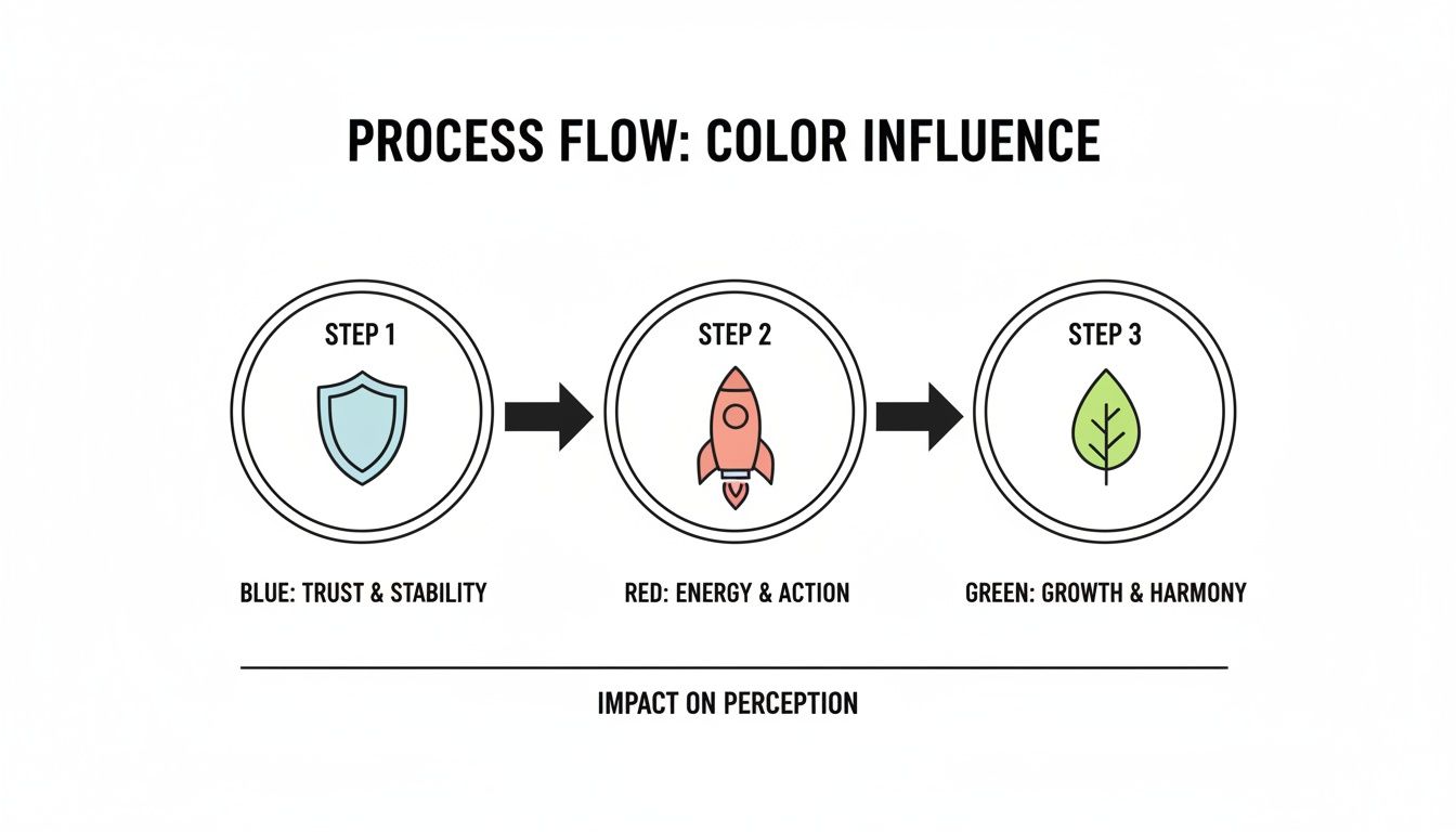
As you can see, a structured palette isn't just about looking good; it's about strategically communicating your core values at a glance.
Finding Your Unique Space in the Market
Before you fall in love with a palette, you absolutely have to size up the competition. The goal isn't to copy what they're doing—it's to do the exact opposite. You need to differentiate. If every other SaaS company in your space is using a safe, corporate blue, imagine the impact you could make with a vibrant orange or a sophisticated purple. You'd stand out immediately.
Your color palette is your visual territory. Analyzing the competitive landscape allows you to claim a unique spot in your customer's mind, ensuring you're not just another face in the crowd.
Run a quick audit. It's simple:
- Identify Top Competitors: List five to seven of your main rivals.
- Capture Their Palettes: Screenshot their websites, apps, and ads.
- Analyze the Trends: Is there a dominant color? Is the market flooded with cool tones or warm tones?
- Find Your Opportunity: Look for the gaps. Where can you introduce a completely different color story to tell a unique story?
This exercise turns your color choice from a guess into a calculated, strategic move.
Prioritizing Readability and UI/UX
For a SaaS brand, color has to do more than just look pretty on a marketing site. It has to work inside the product. This is where user interface (UI) and user experience (UX) become non-negotiable. A beautiful, low-contrast color scheme might look chic on a billboard, but if it makes the text in your app unreadable, you’ve got a major problem on your hands. To learn more, check out our insights on creative design and branding.
Always, always test your color combinations for readability and accessibility. You need enough contrast between your text and backgrounds to meet the Web Content Accessibility Guidelines (WCAG). This isn't just about ticking a box; it's about making sure your product is usable for everyone, including people with visual impairments. A functional, accessible palette is the foundation of a brand that’s not just memorable, but truly user-first.
Learning from Real-World SaaS Branding Success
Theory is great, but seeing color psychology drive market leadership is where the real masterclass begins. The most successful SaaS brands don’t just pick pretty colors; they weave entire brand narratives around them. When you break down their choices, you can see exactly how a strategic color palette becomes a serious competitive advantage.
These companies expertly use color to telegraph their core value proposition long before a user ever sees a dashboard. Their palettes aren't an afterthought—they're a cornerstone of their identity, deliberately chosen to stir specific emotions and build that all-important instant recognition. Let's dig into how three industry titans pull it off.
Salesforce Blue for Unshakable Trust
When your entire business is built on managing a company’s most critical asset—its customer data—trust isn't just a selling point. It is the product. Salesforce got this from the get-go, which is why their brand identity is anchored in a solid, dependable blue.
This was no accident. Psychologically, blue is the color of stability, security, and competence. Salesforce’s specific shade is calm and professional, sending a powerful, subconscious message to its enterprise clients: "Your data is safe here. We are reliable. We are the standard."
This single choice has had a massive impact on their market dominance. By consistently using this blue across their platform, marketing, and the colossal Dreamforce events, they’ve cemented their image as a stable giant in a volatile tech world. The color psychology in branding lesson here is simple: if you handle sensitive information, lead with trust.
Slack’s Vibrant Palette for Creative Collaboration
Slack didn't just change how we communicate at work; it completely reinvented the look and feel of it, and its color palette was a huge part of that disruption. Instead of falling back on a stuffy corporate blue or gray, Slack exploded onto the scene with a vibrant, multi-color identity.
Its signature palette—a mix of purple, green, blue, and yellow—screams dynamic interaction. This isn't the color scheme of a rigid, top-down hierarchy. It’s the visual language of a creative, collaborative, and distinctly modern workspace. The blend of bright colors signals that Slack is the central hub where diverse ideas and teams converge.
The real genius of Slack's palette is how it visually embodies its core function. It looks like a conversation—energetic, multi-faceted, and engaging—which makes the brand feel innovative and genuinely fun to use.
This bold approach helped Slack cut through the noise in a crowded market and connect directly with a new generation of professionals who prioritize creativity and fluid communication over old-school corporate structures.
HubSpot Orange for Approachable Power
HubSpot delivers a seriously powerful all-in-one platform for marketing, sales, and service. For a lot of small to medium-sized businesses, a tool that comprehensive could easily feel overwhelming. HubSpot sidesteps this potential hurdle with its signature energetic and friendly orange.
Orange is the color of optimism, enthusiasm, and accessibility. It immediately strips away the sterile, overly corporate vibe that plagues so much B2B software, making the HubSpot brand feel approachable and supportive. Their color choice essentially says, "Yes, our platform is powerful, but it’s also designed for you. It's easy to get started, and we're here to help you grow." When building your brand's visual identity, understanding the best practices for creating a color palette for your design system is crucial for achieving this level of consistency.
By leading with a color that radiates warmth and confidence, HubSpot effectively lowered the barrier to entry for its target audience. The brand comes across less like a complex piece of enterprise software and more like an enthusiastic partner in their success. To see more examples of how identity shapes perception, you might be interested in our case studies where everything starts with identity.
Thinking Beyond Aesthetics with Accessibility and Global Context
A killer brand palette is more than just a pretty face—it has to be intelligent and inclusive. While aesthetics get all the attention, two of the most critical, and often overlooked, aspects of color psychology in branding are digital accessibility and global cultural awareness. Nail these, and you elevate a good design into a great one, forging a real connection with everyone, everywhere.
This isn't about boxing in your creativity. It’s about making your brand smarter. A brand that’s accessible and culturally tuned-in shows a deep respect for its audience, building a kind of trust that goes way beyond a flashy homepage. Let's look at how to put your colors to work for every single user.
Making Your Brand Accessible to Everyone
Digital accessibility is no longer a "nice-to-have"; it's a core business function. Consider this: roughly 1 in 6 people on the planet live with a significant disability, and for many, that impacts how they see and interact with color online. Designing for accessibility means you’re not shutting the door on a huge portion of your audience, including people with color blindness or low vision.
The absolute bedrock of color accessibility is contrast. It’s simply the difference in brightness between your text and its background. Get it wrong, and your content becomes a frustrating, unreadable mess. It’s an instant way to lose a potential customer.
Thankfully, there’s a clear rulebook: the Web Content Accessibility Guidelines (WCAG). These standards give you specific contrast ratios to hit:
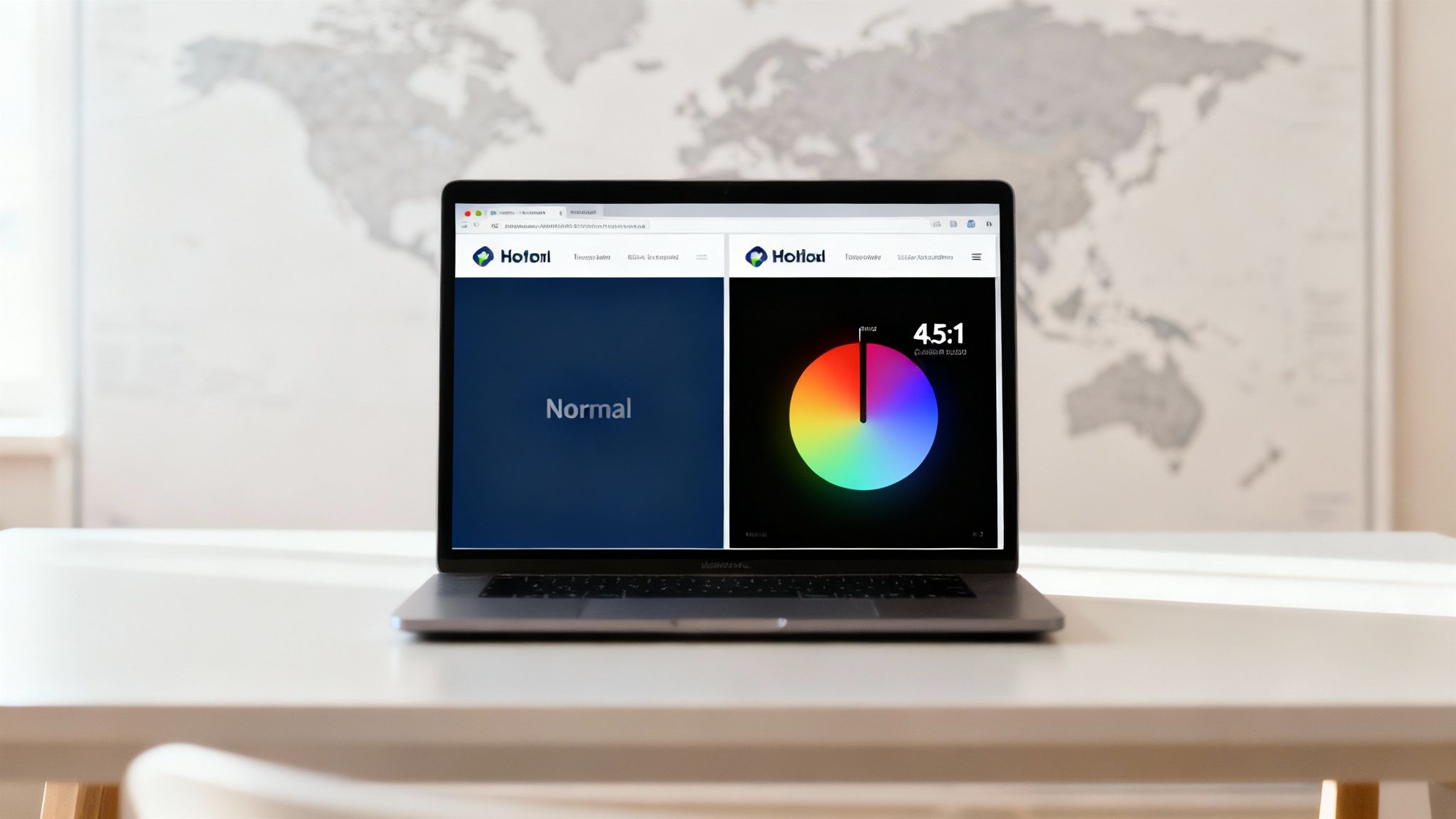
- AA Standard: This is the baseline. Aim for a contrast ratio of at least 4.5:1 for regular text.
- AAA Standard: The gold standard. This requires a much higher contrast ratio of 7:1.
You don’t have to eyeball it. There are fantastic, free tools out there like the WebAIM Contrast Checker or Adobe's Color Contrast Analyzer that give you a clear pass or fail. Weaving these checks into your design workflow is a simple habit that makes a massive impact.
Navigating the Complexities of Global Color Meanings
If your SaaS company has its sights set on global markets, you have to think about cultural context. A color that screams "trustworthy" in one country could be a major red flag in another. Your palette that works perfectly in North America might fall completely flat—or worse, be offensive—in East Asia or the Middle East.
Colors are like words; their meaning changes depending on the local dialect. A globally-minded brand knows this and designs with sensitivity, recognizing that a single hue can tell wildly different stories to different people.
Take white, for example. In the West, it’s all about purity, minimalism, and weddings. But in many parts of Asia, it's the traditional color of mourning. Red is another classic. It symbolizes luck and fortune in China, but in South Africa, it can be tied to danger.
This doesn't mean you need a separate brand identity for every country. It just means doing your homework. A little research on your key markets can help you sidestep major cultural blunders.
Here’s a quick look at just how much these meanings can vary.
Global Color Meanings A Quick Reference
A color's symbolism isn't universal. What you intend to communicate can get lost in translation if you aren't mindful of local interpretations.
| Color | Common Western Meaning | Meaning in Other Cultures (Examples) |
|---|---|---|
| White | Purity, Simplicity, Modernity | Mourning and funerals in many Eastern cultures. |
| Red | Action, Passion, Urgency | Luck and prosperity in China; mourning in South Africa. |
| Yellow | Happiness, Optimism, Caution | Associated with jealousy in France; sacred in India. |
| Green | Growth, Nature, Wealth | Forbidden in Indonesia; national color of Ireland. |
| Blue | Trust, Calm, Corporate | Often seen as a masculine color; wards off evil in Greece. |
Ultimately, a brand that is both accessible and culturally aware is a brand that’s playing the long game. It shows you’re not just building a product—you're building a company that respects and includes everyone it hopes to serve.
How to Test and Measure the Impact of Your Brand Colors
Creative decisions feel good, but they should always be backed by data. While a solid grasp of color psychology gives you a fantastic head start, the real breakthroughs happen when you start testing your theories and measuring the results. This is how your color strategy evolves from a one-time guess into a living, breathing process that constantly improves performance.
The most straightforward way to get started is with A/B testing, sometimes called split testing. It's a simple concept: you create two versions of the same thing, changing just one element—in this case, color—to see which one performs better.
For a SaaS company, this could mean changing the color of the "Request a Demo" button on a key landing page. You might show 50% of your visitors a green button (Version A) and the other 50% an orange one (Version B). After running the test for a while, you can confidently see which color drove more clicks and demo requests.
Key Performance Indicators to Track
To get the full picture of how your audience is reacting, you need to watch the right metrics. The specific KPIs will depend on what you're testing, but a few are essential across the board.
- Click-Through Rate (CTR): This is your go-to metric for call-to-action buttons, email links, and digital ads. A higher CTR is a strong signal that a color is doing its job of grabbing attention and encouraging a click.
- Conversion Rate: The big one. This measures the percentage of people who complete a specific goal, whether it's signing up for a trial, downloading a whitepaper, or making a purchase. It's the ultimate proof of a color's persuasive ability.
- Engagement Metrics: For social media, keep an eye on likes, shares, and comments. You might find that posts featuring a certain color palette consistently spark more conversation and interaction.
- Time on Page: Are people sticking around? A thoughtfully designed page with an inviting color scheme can make visitors more comfortable, which often translates to them spending more time engaging with your content.
Testing isn’t about a one-and-done search for the single "perfect" color. It’s about creating a continuous feedback loop that lets you refine your visual strategy and demonstrate the real, tangible ROI of smart design.
When you connect your color choices to hard data, you move past subjective "I like this one better" conversations. You start making deliberate choices that directly support your business goals. This methodical approach is a cornerstone of effective digital marketing and advertising, making sure your brand’s visual identity works just as hard as every other part of your strategy.
Your Brand Color Questions, Answered
When you get serious about branding, the topic of color always brings up a ton of questions. It's a mix of art and science, and it’s easy to get stuck. Let's walk through some of the most common questions we hear from B2B and SaaS leaders.
One of the first things people want to know is, "How many colors do we actually need?" There’s no hard and fast rule, but a solid framework is the 60-30-10 principle, adapted for branding. Think of it as one primary color that does the heavy lifting, one or two secondary colors for support, and one or two vibrant accent colors for things you want people to notice, like buttons. This approach keeps things clean and recognizable.
How Do We Pick the Right Color?
This is the big one. In a sea of competitors, how do you find a color that stands out? The trick is to stop thinking about what you like and start thinking about strategic differentiation.
Take a good, hard look at your competitors. If everyone in your space is using a safe, corporate blue, that’s your opportunity. Maybe a warm, energetic orange could signal a more user-friendly approach, or a deep green could communicate growth and prosperity. Your color shouldn't just be different for the sake of it; it should be different with purpose and tell a story about what makes you unique.
So, what if your current colors just aren't cutting it anymore? When is it time to rebrand? This is a massive undertaking, so don't take it lightly. You should only really consider a full rebrand if:
- Your business has changed direction entirely—new mission, new audience, new you.
- Your colors are actively hurting you, maybe due to negative cultural shifts or because they fail accessibility tests.
- You’re completely invisible in the market because your look is identical to everyone else's.
A quick refresh is almost always better than a total overhaul. Remember, brand recognition is built over time. You don't want to throw away years of equity just to follow a fleeting trend.
How Do I Know if My Colors Are Working?
Finally, how do you move beyond "I think this looks good" and get to "I know this works"? Simple: you measure it.
Data is your best friend here. Run A/B tests on your call-to-action buttons, landing pages, and ads. Test that green "Get a Demo" button against an orange one and see what happens to your click-through and conversion rates. Recent research consistently shows that emotional responses—which color heavily influences—are a huge part of what drives buying decisions. By testing and tracking, you turn a subjective choice into a tangible business advantage.
Ready to build a brand that commands attention and drives results? At Mick-Mar Inc., we specialize in creating powerful marketing and branding strategies for SaaS and B2B leaders. Let us help you craft a visual identity that resonates with your audience and accelerates your growth. Learn more and partner with us today.