Think of a brand style guide template as a downloadable blueprint for your entire brand. It’s a living document that spells out exactly how to use your logo, which colors to pick, what fonts to type in, and how your brand should sound. It's the one-stop shop for anyone creating anything for your company, making sure it all looks and feels like you.
Why a Brand Style Guide Is Your SaaS Growth Engine

Let's be real—a "style guide" can sound a little stiff and corporate. But for a SaaS company, it's less of a rulebook and more like the source code for your brand identity. It’s what ensures every single touchpoint, from an error message in the app to a blog post, feels intentional and cohesive.
This isn’t just about making things look nice; it's a direct line to building trust. When you deliver a consistent experience, you’re telling customers they can rely on you. In fact, a 2023 study by Lucidpress found that brands that maintain consistency can see their revenue jump by as much as 33%. When users encounter the same visual language and tone everywhere, it builds a quiet confidence in your product.
The Real-World Problems It Solves
As a SaaS company grows, chaos creeps in. We’ve all seen it happen. A partner grabs an old, pixelated logo for a webinar deck. The sales team creates a presentation with off-brand colors. A new support doc sounds nothing like your friendly marketing site. Each instance seems small, but together they chip away at your brand.
A solid style guide puts an end to that by:
- Preventing Brand Dilution: It gets everyone—internal teams, freelancers, and agency partners—on the same page, protecting your brand's integrity as you scale.
- Accelerating Marketing Rollouts: With clear guidelines in place, your team stops wasting time debating hex codes or hunting down the right logo file. They can just create.
- Strengthening User Trust: A consistent experience signals professionalism. It tells users you care about the details, which makes them feel more secure about the software they're paying for.
A brand style guide doesn't stifle creativity; it channels it. By setting the foundational rules, it frees up your team to focus on innovative execution rather than reinventing the wheel on basic branding decisions.
This guide is an essential piece of any smart marketing strategy, acting as the tactical manual for bringing your brand to life every day.
Your Starting Point for Consistency
To get you started right away, we're giving you a downloadable brand style guide template. We're not just going to hand it over; we'll build it out together, step by step, throughout this article. Think of it as your hands-on toolkit. We'll dive into every section, from nailing your visual identity to finding a voice that truly connects. By the time we’re done, you'll have a practical, customized guide ready to go.
Crafting Your Core Brand Identity
Before you touch a single hex code or obsess over the perfect font pairing, you need a story. Every single memorable brand is built on a solid strategic foundation—it's the 'why' behind what you do. This core identity acts as the blueprint for every visual and verbal choice you'll make down the line, giving your brand real substance, not just a pretty face.
Let's be honest, generic mission statements like "to be the leading provider of X" are dead. They don't resonate. Today's customers, especially in the jam-packed SaaS world, are looking to buy into a purpose. This isn't just fluffy marketing talk; it's the internal compass that guides your product roadmap, your customer support scripts, and even your sales calls.
When the entire team rallies around that core mission, their work just clicks. Everything becomes more aligned and a whole lot more impactful. This process ensures that every blog post, every UI button, and every tweet reinforces the same central idea, building a narrative that truly connects with your ideal customer.
From Features to Feelings
Imagine a new fintech SaaS. On the surface, its features are pretty technical: algorithmic trading tools, risk assessment dashboards, complex portfolio models. A brand identity built on those features would feel cold, robotic, and uninspiring.
But what if they built their story around a mission of financial empowerment?
Suddenly, the whole narrative shifts from what the software does to why it actually matters.
- Mission: To democratize sophisticated investment tools, making financial independence accessible to everyone.
- Vision: A world where anyone can confidently build wealth, regardless of their financial background.
- Values: Simplicity, Transparency, Education.
See the difference? The brand is no longer just about algorithms; it's about giving people control over their future. This story now dictates everything that follows. The design has to be clean and approachable (Simplicity). The copy must be jargon-free and direct (Transparency). The content marketing needs to focus on teaching users valuable skills (Education).
This strategic foundation is what turns a simple tool into a trusted partner. For a deeper look at how this works in practice, you can explore a case study where everything starts with identity.
Defining Your Mission, Vision, and Values
Alright, your turn. Get your team in a room (or on a call) and start hashing this out. Be brutally honest and get specific—this is the bedrock of your entire brand. Ditch the clichés and dig for the authentic purpose that gets your team out of bed in the morning.
1. Articulating Your Mission (Your 'Why')
Your mission is your reason for being. It’s the problem you are obsessed with solving right now.
- What specific problem in our industry truly ticks us off?
- Who are we really fighting for? Who is the 'hero' of our story?
- If we vanished tomorrow, what would our customers genuinely miss?
2. Shaping Your Vision (Your 'Where')
Your vision is your North Star. It's the future you're working to create—a world made better because your company exists.
- What does the ideal future look like for our customers?
- What industry-wide change are we trying to spark?
- Ten years from now, what single accomplishment will make us the most proud?
Your brand identity is the promise you make to your customers. Your mission, vision, and values are the terms of that promise, holding you accountable and building unbreakable trust over time.
3. Establishing Your Core Values (Your 'How')
Values are the non-negotiable principles guiding your behavior. They define how you show up every day, both inside the company and out in the world. Stick to three to five core values to keep them memorable and actionable.
Try to move beyond generic terms. Instead of "Innovation," maybe it's "Practical Creativity." Rather than "Customer-First," how about "Empathetic Partnership"? The goal is to land on values that feel true to your team and can actually guide real-world decisions, from who you hire to which features you prioritize. They are the personality of your brand in action.
Defining Your Visual Brand Language
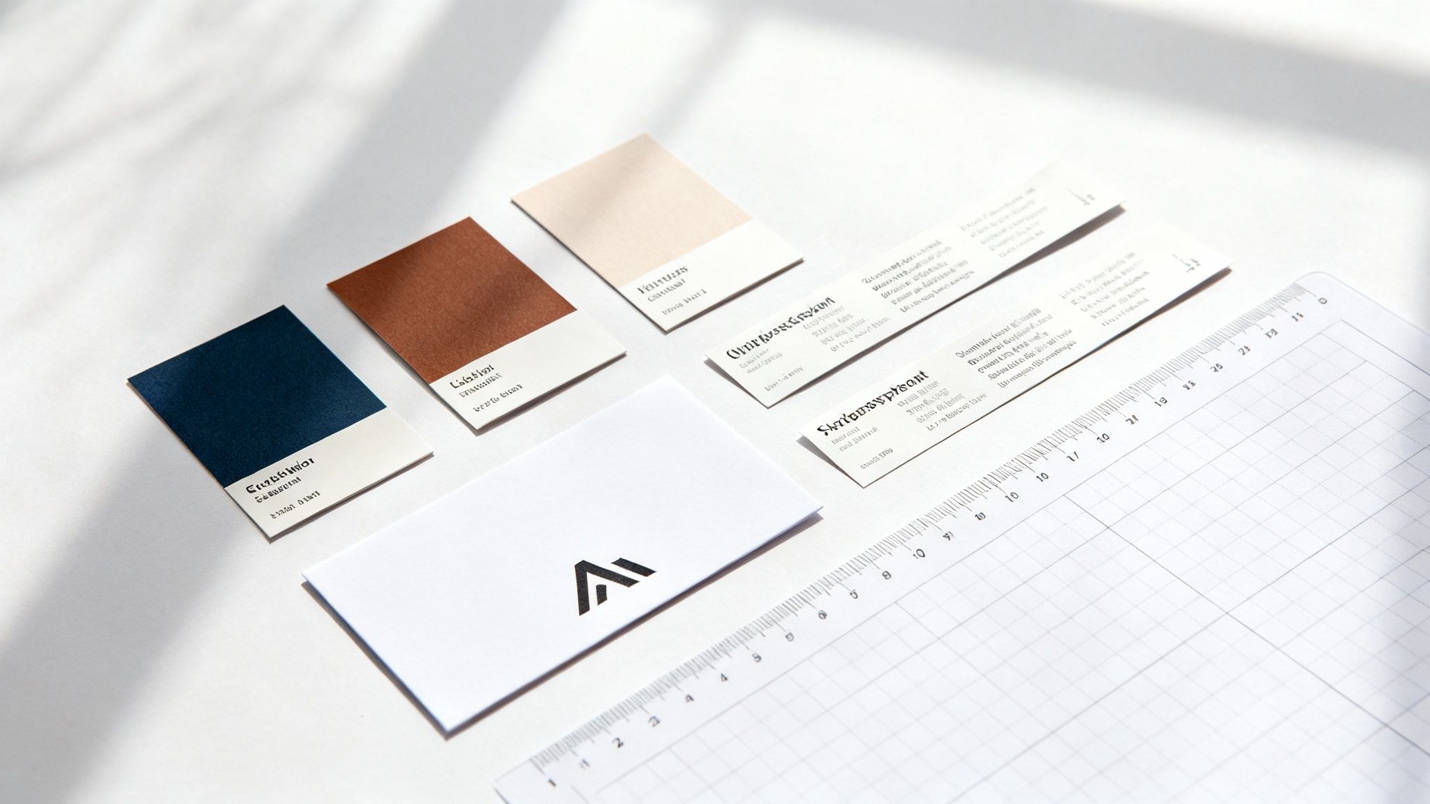
Alright, you've nailed down your brand's core identity. Now comes the fun part: giving it a face. This is where we translate that strategy into a tangible visual system—the colors, shapes, and fonts that will show up on every screen, ad, and email.
This isn’t just about making things look pretty. It’s about being deliberate. Every visual element, from the logo to the typography inside your app, needs to feel like it came from the same brain. This kind of consistency is a massive driver of brand recognition and trust. In fact, brands that keep things consistent can boost their visibility by 3.5 times compared to those that don't.
Your Logo Usage Rules
Your logo is the most concentrated version of your brand. It’s your visual handshake with the world, so you have to be crystal clear about how it can—and can't—be used. Think of this part of your brand style guide template as a protective bubble around your most valuable asset.
Start by showing your primary logo, then lay out any approved variations. This usually covers:
- Primary Logo: The main, full-color version. This is your default.
- Monochromatic Versions: All-black, all-white, or grayscale options for when the full-color logo won't work.
- Icon/Logomark: The symbol-only version. It's perfect for favicons, social media profiles, or tight spaces in your app's UI.
Next, you have to set clear rules to head off the common mistakes that water down your brand. These are your non-negotiables.
Your logo usage guidelines aren't meant to stifle creativity. They're there to eliminate guesswork and stop the small, inconsistent choices that, over time, erode brand recognition.
For instance, scaling is a frequent problem. You need to specify a minimum size to make sure your logo is always readable, whether it’s on a tiny phone screen or a massive trade show banner. You should also define clear space requirements—a designated "breathing room" around the logo that no other text or graphics can invade. Finally, show exactly what not to do with visual examples: don't stretch it, don't rotate it, don't add a drop shadow, and please don't slap it on a busy, low-contrast background.
Building Your Color Palette
Color is your brand’s emotional shortcut. Long before anyone reads a word, your colors have already set a mood. It's essential to understand the power of color in crafting your visual identity, especially for a SaaS company where the palette directly impacts the user experience inside your product.
Your palette needs structure and purpose.
-
Primary Colors: These are your workhorses, the one to three main colors that define your brand. They should be used the most and tie directly back to your brand personality (think of a trustworthy blue for a security tool or a vibrant green for a productivity app).
-
Secondary Colors: This is your accent palette. These two to four complementary colors are used to draw attention to important things like CTA buttons, new feature announcements, or critical alerts in your UI.
-
Neutral Colors: These are the unsung heroes—your grays, whites, and off-blacks. They create balance and are used for body text, backgrounds, and interface elements, letting your primary and secondary colors shine without overwhelming the user.
For every single color, provide the exact codes for different mediums: HEX for web, RGB for digital screens, and CMYK for the rare times you print something. This level of detail is non-negotiable for consistency. It’s what prevents five different "close enough" shades of blue from popping up across your product and marketing.
Choosing Your Brand Typography
Typography is your brand's voice made visible. The fonts you pick say a lot about your personality—are you modern and minimal, or are you more traditional and serious? A good typography system creates a clear visual hierarchy that guides users through your website and app effortlessly. To dive deeper, we have more insights on our creative design and branding page.
Keep it simple and functional. Most brands can get by with just two font families:
- A Primary Typeface: This is for your headlines and major titles. It can have a bit more personality and really capture the spirit of your brand.
- A Secondary Typeface: This is for body copy and paragraphs. Readability is king here. A clean, simple sans-serif font is almost always the right call for digital products.
Once you’ve picked your fonts, define exactly how to use them in your brand style guide template. Specify font weights (like Bold for H1, Semi-Bold for H2, Regular for body text) and sizes for everything from headlines to captions. This builds a predictable structure that makes your content easy to scan and digest, ensuring that a blog post feels like it belongs to the same family as an in-app help article.
Choosing The Right Image Format For Your Assets
When it comes to brand assets, the file format you choose is just as important as the image itself. Using the right format ensures your visuals look crisp on every device without slowing down your site or app. Here’s a quick breakdown to help your team make the right choice every time.
| File Format | Best For | Key Characteristics |
|---|---|---|
| JPEG | Complex photographs, colorful images, and realistic graphics. | Supports millions of colors; uses lossy compression (smaller file size). |
| PNG | Logos, icons, and graphics that require a transparent background. | Supports transparency; uses lossless compression (higher quality). |
| SVG | Logos, icons, and illustrations that need to scale to any size. | Vector-based format; infinitely scalable without losing quality. |
| GIF | Simple animations and short, looping videos. | Limited to 256 colors; best for low-frame-rate animations. |
| WebP | A modern alternative for both photos and graphics on the web. | Offers superior compression (smaller files) with high quality. |
Picking the right format is a balancing act between quality and performance. For most SaaS brands, a combination of SVG for logos and icons, WebP or JPEG for marketing images, and PNG for anything needing transparency will cover all your bases. This ensures a consistent, high-quality experience for every user.
Establishing Your Brand Voice And Tone
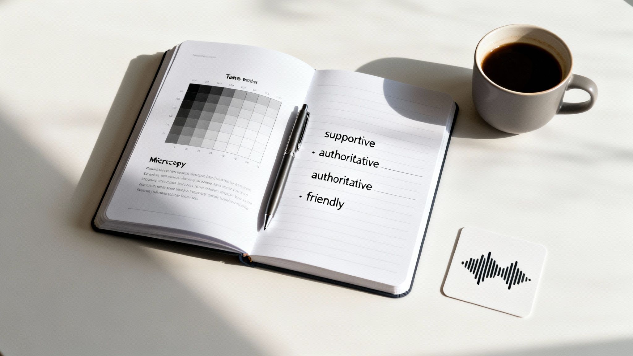
How your brand sounds is every bit as important as how it looks. Your visual identity might be what gets people in the door, but your verbal identity—your voice—is what convinces them to stay. This is where we go beyond logos and colors to truly define your brand's personality through words.
The starting point is getting a handle on the difference between voice and tone. It's helpful to think of it like this: your voice is your fixed personality; it's who you are at your core. Your tone, on the other hand, is your mood. It shifts and adapts depending on who you're talking to and what you're talking about.
For instance, your SaaS brand’s voice might be consistently helpful and expert. That never changes. But your tone will flex. For an in-app onboarding tooltip, you'll sound encouraging and simple. In a technical whitepaper, your tone will become more formal and data-driven. The core personality is the same, but the delivery is tailored to the moment.
Voice Is Who You Are, Tone Is How You Feel
Your brand voice should be a direct reflection of your company's core values. If "Simplicity" is one of your pillars, then your voice needs to be clear, direct, and free of confusing jargon. If "Empowerment" is key, your voice should feel supportive and encouraging.
A fantastic way to nail this down is by using the "We are X, but not Y" framework. It's a simple but powerful exercise that adds much-needed nuance and sets clear boundaries for anyone writing on your behalf.
Here’s what it looks like in practice:
- We are: Confident, but not arrogant.
- We are: Authoritative, but not robotic.
- We are: Friendly, but not silly.
- We are: Witty, but not sarcastic.
This simple exercise is a game-changer. It acts as a filter, preventing your brand personality from drifting into territory that just doesn't fit. It gives your entire team a clear benchmark for their writing, ensuring every word reinforces who you are. The best modern brand guides do this masterfully—Mailchimp is famous for detailing a voice that's informal and fun yet also deeply knowledgeable. That's why every piece of their communication, from an error message to a global campaign, feels distinctly them. For more inspiration, you can check out some helpful breakdowns on AI Media Studio.
Mapping Your Tone Across Different Channels
Once your voice is locked in, the next step is to map out how your tone adapts across different situations. A tone matrix is the perfect tool for this—it’s incredibly practical and takes the guesswork out of communication for your team.
Let's say we're building a guide for a project management SaaS whose core voice is "Empowering and Efficient." Their tone matrix might look something like this:
| Channel / Context | User Feeling | Our Tone Should Be |
|---|---|---|
| Onboarding Tour | Overwhelmed, Curious | Simple, Encouraging, Patient |
| Error Message (In-App) | Frustrated, Stuck | Direct, Reassuring, Actionable |
| Blog Post for Managers | Seeking Insights | Data-Driven, Authoritative, Strategic |
| Social Media Reply | Engaged, Inquiring | Conversational, Helpful, Personable |
| Technical Documentation | Focused, Learning | Precise, Structured, Authoritative |
Including a matrix like this in your brand style guide template eliminates so much ambiguity. It empowers everyone—from a support agent to a product manager—to speak in a way that feels perfectly aligned, even when their words and emotional delivery are completely different.
Setting The Ground Rules: Do's and Don'ts
Finally, a solid verbal identity gets down to the brass tacks of writing. This is where you document the nitty-gritty details of grammar, punctuation, and even specific word choices. This isn't about micromanaging your team's creativity; it's about making conscious decisions that reinforce your brand's personality at every turn.
Here are a few key areas to define with clear "do's and don'ts":
- Punctuation: Are we a brand that uses the Oxford comma? Do we love an em dash for dramatic effect?
- Capitalization: Do our blog headlines use title case or sentence case?
- Jargon: What industry terms do we deliberately avoid to stay accessible? Which ones are fair game for our expert audience?
- Specific Words: Do we call them "customers" or "users"? Is it a "feature" or a "capability"?
Creating these small rules removes thousands of tiny decisions for your team down the line. That consistency is what makes a brand’s voice feel polished, professional, and instantly recognizable.
When you thoughtfully define your voice, map your tone, and set these practical ground rules, you end up with a verbal identity that’s every bit as strong and consistent as your visual one.
Putting Your Brand Style Guide Into Action
So you’ve done it. You’ve created a beautiful, comprehensive brand style guide. That’s a massive accomplishment, but the job isn't over yet. If it just sits in a shared drive gathering digital dust, it's not working for you. The real value isn't in creating the guide; it's in getting your team to actually use it every single day.
This is where you need a playbook. The goal is to make using the guide feel like the natural, default way of doing things—not some extra chore tacked onto a project. When grabbing the right logo or using the correct brand voice is the path of least resistance, you'll see consistency pop up everywhere, from your marketing campaigns to your product updates.
Making Your Guide a Living Document
Static PDFs and buried files are where great brand guides go to die. For your guide to truly take hold, it has to be accessible, interactive, and regularly updated. Think of it less like a finished book and more like a living resource that grows and changes right alongside your brand.
Here are a few practical ways to bring it to life:
- Centralize It: Pick one single, ridiculously easy-to-access spot for it. This could be a dedicated Slack channel, a pinned file in Notion, or a company-wide brand portal. The point is to make finding it a total no-brainer.
- Make it Actionable: Don’t just show the rules; give people the tools. Embed direct download links for logos, icons, presentation templates, and other key assets right inside the guide. The easier you make it for someone to grab what they need, the more likely they are to use the right stuff.
Your brand style guide should never feel like a museum piece to be admired from a distance. It’s a workshop, filled with the tools and materials your team needs to build amazing things. The more hands-on and useful it is, the more it will be used.
Leading brand management platforms have moved towards dynamic guides for this very reason. They often feature in-use galleries showing how logos, colors, and icons look in real-world applications. This helps teams visualize and implement the identity correctly across thousands of different touchpoints. For a great example of how a large organization does this, you can explore the Minnesota state brand style guide.
The Simple Rollout Checklist
Getting your new guide into the right hands takes more than just a launch email. True adoption happens when the guide becomes part of your company's DNA.
- Announce and Educate: Kick things off with a company-wide announcement. But don't just send the file and call it a day. Host a quick training session to walk everyone through the key sections and explain why these guidelines are so important for the business.
- Onboard New Hires: Make reviewing the brand style guide a mandatory step in your onboarding process for every single new employee, not just designers or marketers. This builds a culture of brand consistency from their very first day.
- Equip Your Partners: Don't forget your external team. Share a simplified version of the guide with all freelancers, agencies, and partners. This ensures everyone who represents your brand is singing from the same hymn sheet.
Once you've defined your brand style, you have to translate those principles into tangible actions on every platform. For a deeper look at applying your brand's look and voice effectively online, these social media branding guidelines offer some great, actionable advice.
Establishing a Governance Process
A brand guide that never changes will be outdated in a year. A simple governance process keeps it relevant without creating a bunch of red tape. This isn't about rigid rules; it's about having a clear system for communication and evolution.
First, assign a point person. Who's the go-to for brand questions? This might be a brand manager, a lead designer, or a marketing director. Make sure their name and contact info are clearly listed in the guide itself so people know who to ping when they need a new logo format or have a question about tone.
Next, get a review cadence on the calendar. A quarterly check-in works well for small updates, like adding new assets or refreshing examples. Then, plan for a more thorough annual review to ask the big questions: Does our core messaging still resonate? Does our color palette still align with our market position? This proactive approach ensures your brand style guide template remains a powerful, relevant tool that actually supports your company’s growth.
Common Questions About Brand Style Guides
As you put the finishing touches on your own brand style guide template, a few questions always seem to surface. It’s totally normal to think about the long-term care and feeding of this new resource. Let's dig into some of the most common questions I hear, so you can feel confident putting your guide to work.
How Often Should We Update Our Brand Style Guide?
Your style guide should be a living document, not something carved in stone. It has to grow and change right along with your business. For most SaaS companies, a simple rhythm is all you need.
I’ve found that a light review each quarter and a more thorough update annually works wonders. Those quarterly check-ins are perfect for small tweaks—maybe you need to add a new partner logo, refresh some product screenshots after a UI update, or drop in some new photography.
The annual review is where you zoom out. Step back and really look at the bigger picture. Does your mission statement still hit the mark after a year of hard work and growth? Is your color palette still a good fit for where you stand in the market? Keeping your guide fresh is the only way to ensure it remains a trusted, go-to resource that your team actually wants to use.
What Is The Difference Between A Brand Book And A Brand Style Guide?
You'll often hear these terms used interchangeably, but there's a subtle yet important difference between them. Think of it this way: a brand style guide is tactical, while a brand book is strategic.
- A brand style guide is your day-to-day playbook. It’s the document your designers, marketers, and developers will have open constantly. It’s packed with the practical specifics: logo usage rules, color codes, typography scales, and voice guidelines.
- A brand book covers all of that practical stuff but also goes much deeper into your brand’s why. It tells your company’s origin story, explores the meaning behind your mission and values, and paints a much richer picture of your brand's purpose.
For most growing SaaS companies, a solid, actionable brand style guide is the most critical first step. It delivers the clarity your team needs to get things done right, right now.
Can Our Style Guide Be Too Restrictive For Creativity?
This is a great question, and I hear it all the time. The fear is that a guide will just box in your creative team, leading to a bunch of cookie-cutter designs and uninspired copy. But a well-crafted style guide should do the exact opposite—it should fuel creativity, not kill it.
A great style guide removes the tedious guesswork around the basics. It establishes the foundational rules so your team doesn't have to waste mental energy debating hex codes or hunting for the right font.
This frees up your creative folks to focus their brainpower on the bigger, more strategic challenges, like nailing an amazing campaign concept or designing a beautiful new feature. The guide provides consistency, which in turn allows for creative execution within a clear and supportive framework. It's about creating harmony, not homogeneity.
The process below shows a simple way to roll out your guide, making sure everyone has what they need to be creative within the brand framework.
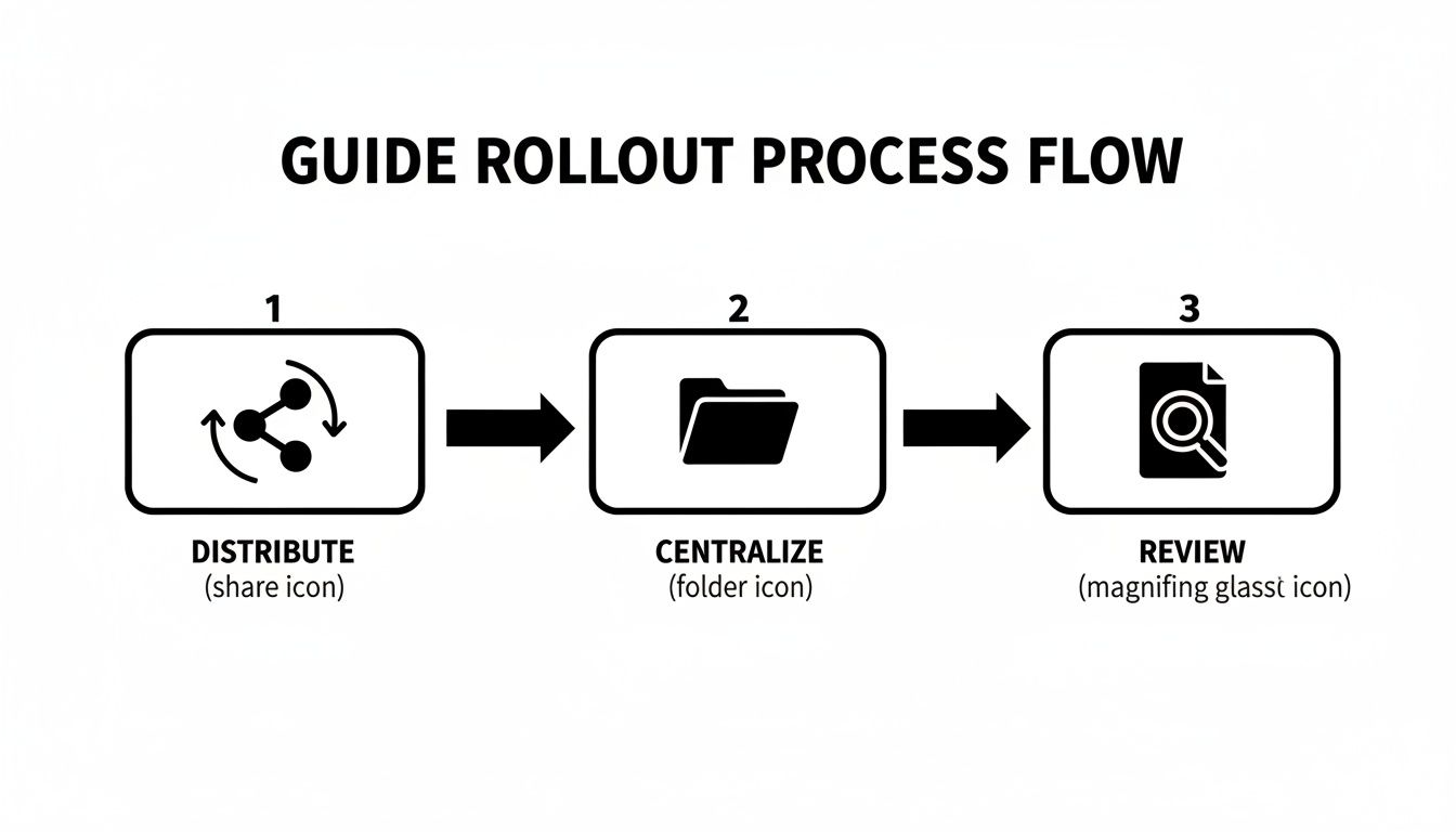
This simple flow—distribute, centralize, and review—is how you turn your brand guide from a set of restrictive rules into a tool for empowerment.