Is your website truly working for you? For many companies, a website isn't just a digital brochure; it's the primary sales and marketing engine, the main hub for lead generation, and the digital face of the brand. As user expectations and business goals evolve, even the best sites need a strategic overhaul to stay effective. A redesign can feel like a huge task, but it's an incredible opportunity to significantly boost conversions, enhance user experience, and realign your digital presence with your growth goals. This process is far more than a cosmetic update—it’s a strategic project to build a high-performing asset that directly contributes to your bottom line.
A 2023 study by Crayon highlighted that 73% of companies are investing in design specifically to help their brand stand out from the competition, proving that a thoughtful aesthetic is now a key market differentiator. However, a successful redesign goes beyond visual appeal. It demands a methodical approach that balances creative vision with technical precision and data-backed decisions. Without a clear plan, projects risk scope creep, budget overruns, and a final product that fails to meet critical business needs.
That's where this website redesign checklist comes in. We’ve broken down this complex process into 10 actionable, value-driven stages, providing a friendly roadmap for marketing professionals and business leaders. This guide will walk you through every critical step, from initial planning and stakeholder alignment to technical QA, launch, and post-launch optimization. Following this framework will help ensure no detail is overlooked and your next website launch is a measurable, resounding success.
1. Conduct User Research and Analytics Audit
The first and most critical step in any effective website redesign checklist is to ground your decisions in data, not assumptions. Before a single wireframe is drawn, you need to deeply understand how users currently interact with your site and what might be preventing them from converting. This foundational phase involves a two-pronged approach: a quantitative analytics audit and qualitative user research.
By analyzing your existing website performance data, you can uncover objective truths about user behavior. This means digging into tools like Google Analytics to identify high-traffic pages, drop-off points in the user journey, and conversion rates. Simultaneously, qualitative methods like user interviews and feedback surveys provide the "why" behind the numbers, revealing user frustrations and motivations.

Why It's a Crucial First Step
Jumping into design without this initial research is like building a house without a blueprint. You risk investing significant time and resources into a new site that fails to address core user problems, leading to a costly redesign that doesn't improve key business metrics like lead generation or sales. This data-driven approach ensures your new design is a strategic solution, not just a cosmetic update.
"You cannot understand good design if you do not understand people; design is made for people." – Dieter Rams, Industrial Designer
How to Implement This Step
Your goal here is to get a holistic view of your website's current performance and user experience.
- Analytics Audit: Review at least 3-6 months of historical data in Google Analytics or a similar platform. Look for underperforming pages, high bounce rates on key landing pages, and where users abandon the conversion funnel.
- Behavioral Analysis: Use tools like Hotjar or Crazy Egg to review heatmaps and session recordings. This shows you exactly where users click, how far they scroll, and where they get stuck.
- User Interviews: Conduct one-on-one interviews with 15-20 representative users from your target audience. Ask open-ended questions about their goals and pain points when using your current site.
- Create Personas: Synthesize your findings to create 3-5 user personas that represent your key audience segments. These data-backed personas will guide every subsequent design and content decision.
2. Define Clear Goals and KPIs
Once you understand your users, the next step in your website redesign checklist is to define what success looks like. A redesign without clear, measurable goals is merely a cosmetic exercise. You must establish specific, quantifiable objectives that align directly with your broader business strategy, ensuring the project delivers a tangible return on investment.
This process involves translating high-level business needs, like "increase revenue," into specific key performance indicators (KPIs) for the website. For example, a goal to increase sales might translate to a KPI of "improve e-commerce conversion rate by 15% within six months." This clarity guides every design and development decision, from the homepage layout to the checkout process.
Why It's a Crucial Step
Without predefined goals, you have no way to measure whether the redesign was successful. You risk ending up with a site that looks modern but performs worse than the original, failing to improve lead generation, user engagement, or sales. Setting goals and KPIs from the start provides a framework for decision-making and a benchmark for post-launch analysis, holding the project accountable to business outcomes.
"What gets measured gets managed. If you don't have clear goals, you're just decorating." – Peep Laja, Founder of CXL
How to Implement This Step
Your objective is to create a set of SMART (Specific, Measurable, Achievable, Relevant, Time-bound) goals that will guide the entire redesign project.
- Align with Business Objectives: Meet with key stakeholders to translate company-wide goals into website-specific KPIs. If the business goal is to increase market share, a website KPI could be to increase organic traffic from non-branded keywords by 30%.
- Establish Baselines: Before you begin, document your current performance metrics. Record your average conversion rate, bounce rate, page load speed, and user engagement metrics. This baseline is essential for measuring improvement.
- Set Short and Long-Term Goals: Define targets for both the first three months post-launch (e.g., reduce bounce rate on the pricing page by 10%) and the first year (e.g., increase qualified demo requests by 25%).
- Create a KPI Dashboard: Set up a dedicated dashboard in Google Analytics 4 or your analytics tool of choice to track your primary KPIs in real-time. This allows for continuous monitoring and agile adjustments after launch.
3. Audit Current Website Content and Structure
With your user research complete, the next critical item on your website redesign checklist is to conduct a thorough audit of your existing content and information architecture. A redesign isn't just about a new look; it's a chance to streamline, update, and reorganize your entire digital footprint for a better user experience and stronger SEO performance. This process involves cataloging every page and asset on your current site to make strategic decisions about what to keep, what to update, and what to remove entirely.
A comprehensive content audit prevents you from carrying over outdated, underperforming, or redundant content to your new site. By systematically evaluating your site's structure, you can identify confusing navigation paths and opportunities to create a more intuitive journey for your visitors. This step helps ensure every piece of content on your new site has a clear purpose.
Why It's a Crucial Step
Skipping a content audit is a common but costly mistake. Without it, you risk migrating confusing navigation, broken links, and low-quality content to your new platform, undermining the entire redesign investment. A proper audit ensures your new site architecture is logical, user-centric, and built on a foundation of high-value content that meets both user needs and business goals. This step directly impacts SEO, user engagement, and conversion rates.
"Good content isn't about good storytelling. It's about telling a true story well." – Ann Handley, Chief Content Officer
How to Implement This Step
Your goal is to create a complete inventory of your website's content and evaluate each piece based on performance, relevance, and quality.
- Crawl Your Website: Use a tool like Screaming Frog or Semrush to generate a complete list of all URLs on your site. This provides the raw data for your audit, including page titles, meta descriptions, and response codes.
- Create a Content Inventory: Export the crawl data into a spreadsheet. Add columns to categorize each page by content type (e.g., blog post, landing page, case study), performance metrics (traffic, conversions), and a recommended action (Keep, Improve, or Remove).
- Analyze and Categorize: Review each URL. Preserve high-performing, evergreen pages. Identify pages that can be updated or consolidated to improve their value. Flag outdated or low-traffic pages for removal and redirection.
- Plan Your Content Strategy: Use the insights from your audit to inform your new information architecture and content plan. Planning your content production and updates is essential; you can learn how to create a content calendar to manage this process effectively.
4. Competitor and Industry Benchmarking Analysis
After understanding your own users, the next step in a comprehensive website redesign checklist is to look outward. Benchmarking your website against competitors and industry leaders provides crucial context, helping you identify established user expectations, emerging design trends, and, most importantly, opportunities to differentiate your brand. This process involves a systematic review of what others in your space are doing well and where they fall short.
This analysis goes beyond a simple visual comparison. It's about dissecting the user experience, messaging, and functionality of other sites to inform your own strategic decisions. You're looking for patterns in what works, but also for gaps you can fill. Seeing how others solve similar problems can spark innovative ideas for your own project.
Why It's a Crucial Step in Planning
Ignoring the competitive landscape is like navigating without a map. You might build a functional website, but it may fail to stand out or meet the baseline expectations your audience has formed from interacting with other sites. A thorough analysis prevents you from reinventing the wheel on standard features and highlights gaps in the market that your new design can exploit to gain a competitive edge.
"If you know the enemy and know yourself, you need not fear the result of a hundred battles." – Sun Tzu, The Art of War
How to Implement This Step
Your goal is to build a clear picture of the digital ecosystem your website operates in and define how your redesign will position you for success. To truly understand your market position and identify opportunities for your redesign, it's crucial to learn how to conduct competitor analysis effectively.
- Identify Competitors: Compile a list of 5-10 direct competitors and aspirational industry leaders. Also, include 2-3 companies outside your industry known for exceptional user experience for inspiration.
- Document Strengths and Weaknesses: Create a spreadsheet to systematically evaluate each site. Analyze their information architecture, visual design, calls-to-action (CTAs), content quality, and key features. Note what works well and what creates friction.
- Create Mood Boards: Use a tool like Figma or Miro to create mood boards. Collect screenshots of compelling layouts, typography, color palettes, and interactive elements that align with your brand's future direction.
- Define Your Differentiators: Based on your analysis, pinpoint 3-5 key opportunities for differentiation. This could be a clearer value proposition, a more seamless user journey, or a unique interactive feature that no one else offers.
5. Create Wireframes and Information Architecture
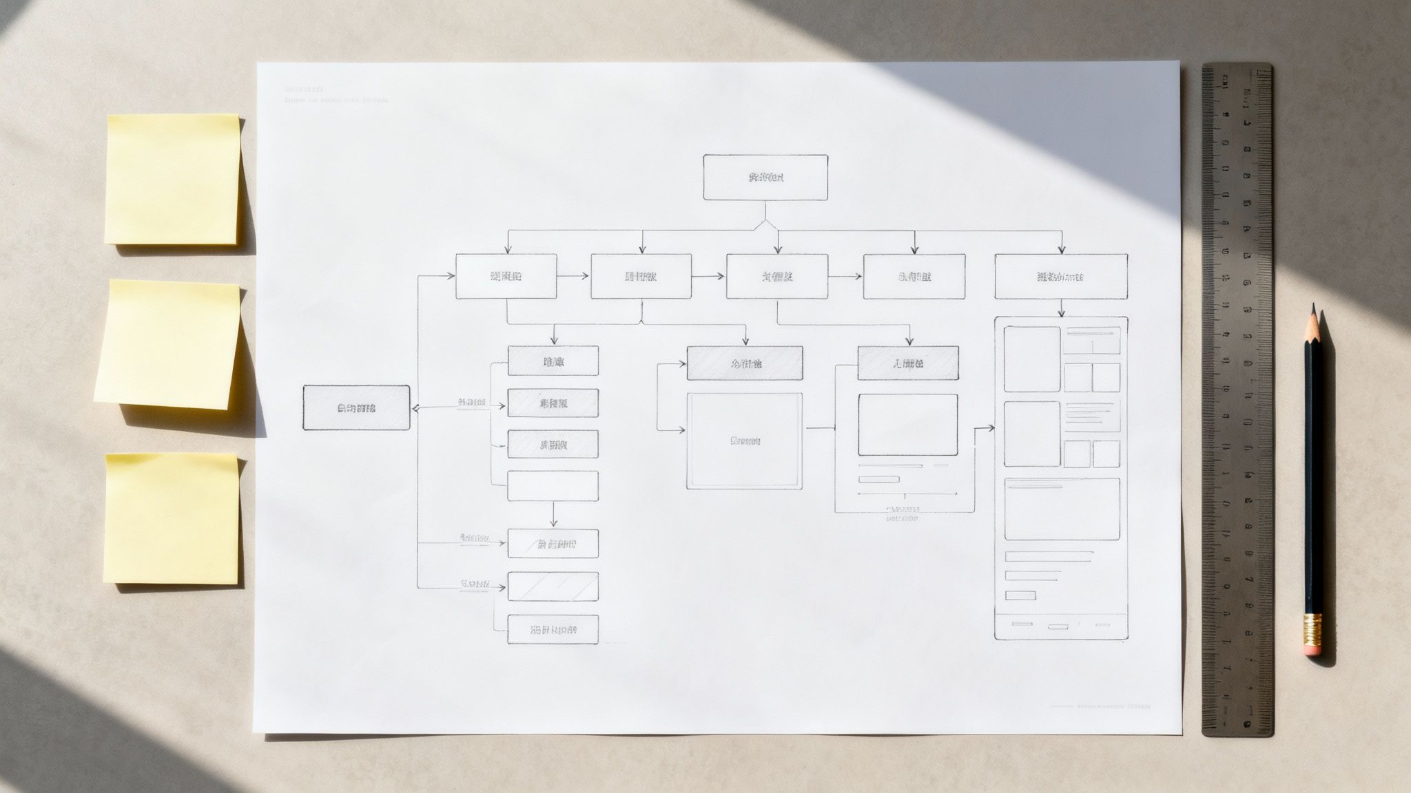
After establishing your goals and understanding your users, the next step in your website redesign checklist is to create the structural blueprint of your new site. This involves developing wireframes and a clear Information Architecture (IA) before any visual design begins. This low-fidelity planning stage focuses purely on layout, functionality, and user flows, stripping away aesthetic distractions like colors and fonts.
Think of it as the architectural drawing of your website. This approach allows for rapid iteration and feedback on the core user experience. Instead of debating a shade of blue, stakeholders can focus on whether the user journey is logical and if key information is easy to find. It’s about structuring the house before you start painting the walls, ensuring the foundation is solid.
Why It's a Crucial Planning Step
Skipping the wireframing stage is a common but costly mistake. It forces major structural decisions to be made during the high-fidelity design phase, where changes are more time-consuming and expensive. A well-defined IA and wireframe ensure that the site's structure directly supports user goals and business objectives, preventing frustrating user experiences and scope creep down the line.
"The details are not the details. They make the design." – Charles Eames, Designer
How to Implement This Step
Your goal is to build a functional skeleton of the website that maps out content, hierarchy, and user pathways for key pages.
- Define Information Architecture (IA): Start by creating a sitemap that outlines the hierarchy and relationship between all pages. Use your user research to organize content intuitively from the user's perspective, not your internal company structure.
- Keep Wireframes Low-Fidelity: Initially, use simple grayscale boxes and placeholder text (lorem ipsum) to represent elements. Tools like Balsamiq, Figma, or even pen and paper are perfect for this. The focus is on structure, not beauty.
- Map Key User Flows: Alongside your wireframes, visually map out the steps a user persona would take to complete a primary goal, like requesting a demo or finding pricing. This connects individual page layouts into a cohesive journey.
- Create Mobile-First Variations: Design wireframes for mobile and desktop views simultaneously. This mobile-first approach ensures the core experience is optimized for smaller screens, which often account for a majority of B2B research traffic.
- Gather Stakeholder Feedback: Share your wireframes and sitemap with key stakeholders early and often. It is far easier and more cost-effective to move a box on a a wireframe than to recode a fully designed page.
6. Develop Design System and Visual Guidelines
After establishing your information architecture, the next item on your website redesign checklist is to create a robust design system. This isn't just a style guide; it's a comprehensive library of reusable components, patterns, and guidelines that dictate your site's visual and functional language. A design system ensures that every button, form field, and layout grid is consistent, scalable, and on-brand across the entire digital experience.
By building this centralized resource, you empower both designers and developers to build new pages and features quickly without reinventing the wheel. This approach streamlines the development process, reduces design debt, and ensures a cohesive user experience as your website evolves. A great design system acts as a single source of truth for your entire team.
Why It's a Crucial Step for Scalability
Launching a redesign without a design system is a recipe for long-term inconsistency. As new team members join and new features are added, the visual identity can slowly fragment, leading to a disjointed user experience and a much more difficult site to maintain. A design system acts as the single source of truth, ensuring that your brand's integrity remains intact as you scale.
"A design system isn't a project. It's a product, serving products." – Nathan Curtis, Design System Expert
How to Implement This Step
Your goal is to create a living, accessible document that serves your entire product team, from design to development.
- Establish Core Principles: Start with the foundational elements. Define your color palette (primary, secondary, and neutral colors), typography scales (headings, body text, captions), spacing rules, and grid system.
- Build a Component Library: Create a comprehensive set of reusable UI components, such as buttons, input fields, cards, and navigation bars. Document all variations and states for each component (e.g., hover, active, disabled).
- Prioritize Accessibility: Integrate accessibility standards from the beginning. Ensure color contrasts meet WCAG 2.1 AA guidelines and that all components are designed for keyboard navigation and screen readers.
- Create Centralized Documentation: Use a tool like Storybook, Figma, or Zeroheight to build and maintain your design system. This documentation should be easily accessible to designers, developers, and marketers.
7. Mobile-First and Responsive Design Planning
In today's digital landscape, prioritizing mobile users isn't just an option; it's a necessity. This step in your website redesign checklist involves adopting a "mobile-first" approach, where you design the user experience for the smallest screen first and then scale up to tablet and desktop. With a significant portion of web traffic originating from mobile devices, this strategy ensures you are catering to the majority of your audience from the outset.
A mobile-first strategy forces you to focus on the most essential content and functionality, resulting in a cleaner, more intuitive user experience across all devices. This approach is fundamentally different from designing for a desktop and then trying to shrink it down, which often leads to cluttered interfaces and poor usability on smaller screens.

Why It's a Crucial Design Step
Ignoring a mobile-first approach risks alienating a massive segment of your audience and negatively impacting your SEO, as Google prioritizes mobile-friendly sites in its rankings. A poor mobile experience can lead to high bounce rates, low engagement, and lost conversions. It’s no longer enough for a site to just "work" on mobile; it has to provide an excellent experience.
"The mobile device has become our gateway to the digital world." – Sundar Pichai, CEO of Alphabet Inc.
How to Implement This Step
Your goal is to create a seamless and effective experience for users, regardless of the device they use.
- Design for Mobile First: Begin the design process with the mobile layout. Focus on core user journeys and content hierarchy for the smallest screen. This constraint encourages clarity and efficiency.
- Prioritize Performance: Optimize images and scripts specifically for mobile to ensure fast loading times. Mobile users expect speed, and delays can lead to immediate abandonment.
- Test on Real Devices: While browser emulators are helpful, they don't replicate the real-world user experience. Test your design on a variety of actual smartphones and tablets to identify touch-target issues and performance lags.
- Simplify Navigation: Implement a simple, intuitive navigation system for mobile, such as a "hamburger" menu or a streamlined bottom navigation bar. Ensure touch targets are at least 44×44 pixels to be thumb-friendly. For an in-depth look at ensuring your redesign is mobile-first, consult a comprehensive mobile website optimization guide.
8. Accessibility and Compliance Review
An essential but often overlooked item on any modern website redesign checklist is a thorough accessibility and compliance review. This step involves designing and building your new website so that people with disabilities can use it effectively. It means ensuring compliance with established standards, most notably the Web Content Accessibility Guidelines (WCAG) 2.1 AA level.
This process moves beyond basic usability to create an inclusive digital experience for everyone. It involves technical and design considerations like proper color contrast for visually impaired users, full keyboard navigability for those who cannot use a mouse, and compatibility with screen reader software. By embedding accessibility into your redesign from the start, you not only serve a wider audience but also mitigate legal risks and strengthen your brand's reputation.
Why It's a Crucial Step
Ignoring accessibility is not just a disservice to the 25% of U.S. adults living with a disability; it's a significant business liability. Lawsuits related to web accessibility have been on the rise. A 2023 report noted that digital accessibility lawsuits increased by 30% from the previous year. A proactive approach ensures your site is open to all potential customers and protects your organization from costly litigation and brand damage.
"The power of the Web is in its universality. Access by everyone regardless of disability is an essential aspect." – Tim Berners-Lee, Inventor of the World Wide Web
How to Implement This Step
Your goal is to integrate accessibility principles throughout the design and development lifecycle, not just as a final check.
- Audit and Test: Use automated tools like WAVE and axe DevTools to catch initial issues, but supplement this with manual testing. Test navigation using only a keyboard and use screen readers like NVDA (free) or JAWS to experience the site as a visually impaired user would.
- Design Inclusively: Ensure your design system specifies a color contrast ratio of at least 4.5:1 for normal text. Plan for clear focus states on all interactive elements so keyboard users can see where they are on the page.
- Semantic HTML: Instruct developers to use proper HTML5 elements (e.g.,
<nav>,<main>,<button>). This provides a clear structure that assistive technologies rely on to interpret your content. - Provide Alt Text: Every meaningful image must have descriptive alternative text. This is crucial for screen reader users to understand the visual information on a page.
- Involve Real Users: If possible, include users with disabilities in your testing phase. Their feedback is invaluable for identifying real-world barriers that automated tools might miss.
9. Performance Optimization and Technical Planning
A visually stunning website that takes too long to load is a liability. This is why performance optimization and technical planning are a non-negotiable part of any modern website redesign checklist. This step involves proactively planning for a fast, responsive, and technically sound website by focusing on factors like page load speed, Core Web Vitals, image optimization, and caching. A high-performing site directly impacts user experience, SEO rankings, and conversion rates.
In today's digital landscape, users expect near-instantaneous results. A slow website leads to high bounce rates and lost revenue. In fact, Google research from 2023 showed that the probability of a mobile user bouncing increases by over 100% if a page takes 5 seconds to load. By embedding performance goals into the planning phase, you ensure the technical foundation of your new site is built for success from day one, not treated as an afterthought.
Why It's a Crucial Step for SEO and UX
Poor performance is a conversion killer and an SEO penalty. Since 2021, Google’s Core Web Vitals (CWV) have been a direct ranking factor, meaning slow sites are actively penalized in search results. A technically optimized site not only satisfies search engines but also delights users, leading to longer session durations, lower bounce rates, and a significant boost in user trust and conversions.
"For every 100-millisecond decrease in homepage load speed, Mobify's customers saw a 1.11% lift in session-based conversion, amounting to an average annual revenue increase of $376,789." – WPO Stats
How to Implement This Step
Integrate performance planning from the initial stages of your redesign project. Your goal is to build a fast, efficient, and technically robust website.
- Set a Performance Budget: Before development begins, establish clear performance goals. A common target is a Largest Contentful Paint (LCP) of under 2.5 seconds and a total load time under 3 seconds.
- Optimize All Images: Use modern image formats like WebP, which offer superior compression. Implement responsive images that serve different sizes based on the user's device and use lazy loading for images that are below the fold.
- Utilize a CDN and Caching: Implement a Content Delivery Network (CDN) to serve static assets like images and scripts from a server closer to the user, dramatically reducing latency. Configure browser and server-side caching to store frequently accessed resources.
- Minimize Render-Blocking Resources: Audit and minimize CSS and JavaScript files that block the initial rendering of the page. Defer non-critical scripts and inline critical CSS to ensure the most important content loads first. This is a key part of technical SEO; you can learn more about organic SEO optimization here.
10. Testing Strategy and Launch Plan
A successful launch isn't the end of your website redesign checklist; it’s a meticulously planned transition from development to live deployment. A comprehensive testing and launch strategy ensures your new site is not only functional and bug-free but also validated by real user behavior. This phase moves beyond internal checks to real-world validation, mitigating risks and setting the stage for continuous improvement.
This process involves a multi-faceted testing approach, from cross-browser compatibility and device responsiveness to User Acceptance Testing (UAT) with actual target users. The goal is to catch any technical glitches or usability issues before they impact your entire audience. It culminates in a staged rollout plan, allowing you to monitor performance, gather feedback, and address issues in a controlled environment.
Why It's a Crucial Pre-Launch Step
Launching a redesigned website without rigorous testing is a gamble that can damage user trust and hurt your brand's reputation. A buggy or confusing experience can lead to a spike in bounce rates and a drop in conversions, negating the entire investment of the redesign. A phased launch plan allows you to de-risk the process and ensure a smooth, positive transition for your users.
"For a web application, testing is as important as the development of the product itself. In the absence of testing, you can’t be sure whether the app will be able to serve its purpose or not." – Amit Agarwal, Digital Inspiration
How to Implement This Step
Your objective is to validate the new design's performance, usability, and technical stability before it goes live to everyone.
- Comprehensive Testing: Conduct thorough cross-browser and device testing to ensure a consistent experience. Use UAT with a small group of actual customers, not just internal stakeholders, to gather unbiased feedback on usability and functionality.
- A/B Testing Key Pages: Before a full rollout, consider A/B testing critical pages like the homepage or pricing page. This allows you to gather data on which design variations drive better outcomes. To explore this further, you can get insights on how to improve website conversion rates at mick-mar.com.
- Develop a Staged Rollout Plan: Avoid a "big bang" launch. Instead, roll out the new site in phases: first to internal employees, then to a small percentage of users (e.g., 5-10%), and gradually increase exposure as you monitor performance and feedback.
- Monitor and Prepare: Set up real-time monitoring for key metrics like server error rates, page load times, and conversion rates. Have a dedicated support team on standby during launch week to quickly address any user-reported issues.
10-Point Website Redesign Comparison
| Initiative | 🔄 Complexity | ⚡ Resource requirements | ⭐ Effectiveness | 📊 Expected outcomes | 💡 Ideal use cases & advantages |
|---|---|---|---|---|---|
| Conduct User Research and Analytics Audit | 🔄🔄🔄🔄 (High) | Tools: Google Analytics, Hotjar; Team: UX researcher; Time: medium–high | ⭐⭐⭐⭐⭐ | Identifies real pain points; baseline metrics for measurement | When user behavior is unclear; prevents costly assumptions; data-driven prioritization |
| Define Clear Goals and KPIs | 🔄🔄🔄 (Medium) | Tools: dashboards; Team: PM, stakeholders, analyst; Time: low–medium | ⭐⭐⭐⭐ | Clear success criteria; aligned priorities and measurable targets | Aligns redesign with business goals; useful before scope definition |
| Audit Current Website Content and Structure | 🔄🔄🔄🔄 (High) | Tools: Screaming Frog, GSC; Team: content strategists; Time: high | ⭐⭐⭐⭐ | Cleaner IA, improved SEO, removed redundancies | Best for legacy sites or large content inventories; reduces complexity |
| Competitor and Industry Benchmarking Analysis | 🔄🔄🔄 (Medium) | Tools: SimilarWeb, Wayback; Team: strategist/researcher; Time: low–medium | ⭐⭐⭐ | Identifies trends and differentiation opportunities | Useful for market positioning, inspiration, and setting expectations |
| Create Wireframes and Information Architecture | 🔄🔄🔄 (Medium) | Tools: Figma, Balsamiq; Team: UX/UI designers; Time: low–medium | ⭐⭐⭐⭐ | Validated layouts and user flows; fewer design reworks | Early-stage planning to test structure before visual design |
| Develop Design System and Visual Guidelines | 🔄🔄🔄🔄 (High) | Tools: Figma, Storybook, Zeroheight; Team: designers + devs; Time: high upfront | ⭐⭐⭐⭐⭐ | Consistent UI, faster dev, scalable updates | Ideal for multi-product brands or growing teams; improves collaboration |
| Mobile-First and Responsive Design Planning | 🔄🔄🔄🔄 (Medium–High) | Tools: BrowserStack, real devices; Team: designers/devs; Time: medium | ⭐⭐⭐⭐ | Better mobile conversions, improved SEO and performance | Crucial when majority of traffic is mobile; forces content prioritization |
| Accessibility and Compliance Review | 🔄🔄🔄🔄 (Medium–High) | Tools: WAVE, axe, screen readers; Team: accessibility expert; Time: medium | ⭐⭐⭐⭐ | Broader reach, reduced legal risk, SEO benefits | Required for public-facing or regulated sites; improves usability for all |
| Performance Optimization and Technical Planning | 🔄🔄🔄🔄🔄 (High) | Tools: PageSpeed, WebPageTest; Team: DevOps/engineers; Time: high | ⭐⭐⭐⭐⭐ | Faster load times, higher SEO rankings, conversion gains | Essential for high-traffic/ecommerce sites; directly impacts revenue |
| Testing Strategy and Launch Plan | 🔄🔄🔄🔄 (High) | Tools: Optimizely, LaunchDarkly, BrowserStack; Team: QA, analysts; Time: high | ⭐⭐⭐⭐⭐ | Validated releases, reduced launch risk, actionable learnings | Must for major releases or sites with significant traffic; enables safe rollouts |
From Checklist to Reality: Your Next Steps
You've navigated the comprehensive website redesign checklist, from initial user research and goal setting to the intricate details of technical planning and launch strategy. This detailed roadmap is more than just a series of tasks to complete; it's a strategic framework designed to transform your website from a digital brochure into a high-performing growth engine. A successful redesign isn't merely about launching a visually appealing site. It's about building a sustainable, data-driven asset that serves your audience and achieves your business objectives.
The journey you've just mapped out is significant. It requires collaboration across departments, a deep understanding of your users, and a commitment to data-driven decision-making. By embracing this process, you de-risk what is often a high-stakes, high-cost initiative. You move away from subjective preferences and ground your project in what truly matters: user experience, performance, accessibility, and measurable results. Remember, the most successful redesigns are those that are planned with precision long before a single line of code is written or a pixel is pushed.
Recapping Your Path to a Powerful Redesign
Let’s distill the core principles from our checklist into actionable takeaways. These are the foundational pillars that will support your project's success and ensure you deliver long-term value:
- Strategy Before Aesthetics: The most critical phase is the first one. Your user research, analytics audit, and clear goal definition (Steps 1 & 2) provide the "why" behind every subsequent decision. Without this strategic foundation, even the most beautiful design is destined to underperform.
- Structure Dictates Experience: Your Information Architecture and content strategy (Steps 3 & 5) are the blueprints of your user's journey. A logical, intuitive structure makes your site easy to navigate and ensures your valuable content is discoverable, which directly impacts user satisfaction and conversion rates.
- Technical Excellence is Non-Negotiable: Performance, accessibility, and a mobile-first approach (Steps 7, 8, & 9) are not optional add-ons. They are fundamental to modern web experiences. Research consistently shows that technical performance is a direct driver of revenue and brand perception.
- Launch is a Milestone, Not the Finish Line: Your launch plan (Step 10) marks the beginning of a new chapter. The real work of optimization starts post-launch. This is where you leverage the KPIs you defined in Step 2 to measure success, gather real-world user feedback, and begin the cycle of continuous improvement.
The True Value of a Meticulous Process
Following this detailed website redesign checklist does more than just keep you organized. It empowers your team to build a digital experience that is not only visually stunning but also strategically sound. You are building a platform that is user-centric, optimized for search engines, and built on a scalable technical foundation.
This approach ensures your new website becomes your most effective marketing and sales asset. It will attract and convert the right audience, accurately represent your brand's authority, and adapt to the evolving needs of your business and your customers. You're not just checking boxes; you're building a future-proof digital home for your brand that will deliver a tangible return on investment for years to come.
Navigating a comprehensive website redesign can be a complex undertaking, requiring specialized expertise in strategy, design, and development. If you need a strategic partner to guide you through this process and ensure every item on your checklist is executed to perfection, the team at Mick-Mar Inc. specializes in creating impactful, high-performance websites for B2B and SaaS brands. Let's work together to build a digital experience that drives measurable growth for your business.